The monitors are larger,
so we can fit more on the screen
 One of the challenges of design is to have a response to the desire to fit more on the screen, as it seems obvious (to some) that a larger screen means more real estate to fill. Periodically, we also hear a proposal to have wider text, beyond the 75 characters that a person can read without turning their head. And that really depends on whether the device is at 10 feet, like a television or hand-held, like a smart phone.
However, the proportional relationship described by the distance between eyes, the reach of the arm, the amount a person can view without turning their head – those hold true, regardless of the size of the screen, console, device. For most practical purposes, designers use the width of 45-75 characters as the optimal width for reading. That’s actually why we have columns in magazines and newspapers. It makes it easier to read. We can cheat those numbers a bit, but beyond around 80 characters, we need to understand how we’re hurting readers.
As designers of human-computer interactions and experiences, we find ourselves drawing pictures to show people how that works. We draw the distance between human eyes, the viewing distance of the screen, at arm’s length away from the person, and the cone that represents the field of vision. We show a novel held in the hand, and examples from movies such as star wars, where there are a few large words across the screen, but those words fill the whole visual field
A long time ago
In a galaxy
Far far away
We show a person holding up their thumb, and moving it around at arm’s length. This simulates how we parse information, the thumb being the point of attention, and moving the thumb shows the bite-sized chunk of information we see at a time. The size of the monitors has changed, but the focus of human eyes has not. Human-machine interface follows the same rules as the other proportional relationships found in nature, and in the human body.
Fibonacci described the relationships as part of the sequence of numbers and geometry found in the body, and in nature, as part of a spiral known as the divine proportion, or golden ratio. Though we more popularly know of Fibonacci from the Dan Brown novel, The DaVinci Code, his explorations of numbers in nature and the body are fascinating from a design perspective. They remind us that defining space, and designing within that space, can be made more pleasing by paying attention to the golden ratio. We can choose rectangular shapes that follow that ratio; we can also place information in places that the eye will naturally follow, along the curve of the spiral.
Changes in perception are occuring, however, not in ways we may have expected. More often than not, those large screens allow us to switch rapidly between different screens, rather than expanding just one. We can fit more windows on the screen, and move our attention between those windows, and the information contained in them. We also move perceptually between multiple email conversations, surfing, games, and writing, all in parallel. However, unless working on a full-game immersion, or a graphics program, maximizing a window is out. It makes it harder to mouse across to the far edges, adds to fatigue, and frankly too much is missed if it is on the periphery of our vision.
As a user experience designer, I need to be aware of these balance points, and not design experiences that make the user work too hard for the reward of the information they are trying to get to. Making it easier, quicker, more responsive within the frame or window, that’s the ticket.
Ultimately, we design for a variety of screens and devices. We use media queries to determine which stylesheets to use, and how the responsive widths will display the information. We have come a long way from the old world of print, with fixed layouts that are static. The end user wants control of their device, and of their experience. If we listen to that, and pay attention, we will design in a way that respects the person’s wish to change their screen contrast, the fonts, the sizes and the colors. Good design can take all these things into account, and become even more relevant to the person we are designing the experience for. That’s what modern design aims for – the right sized experience in the hands of people with all kinds of different needs.


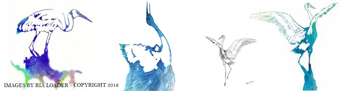
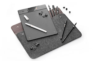
 It was a quiet day at home on Saturday. Picked up the iskn tablet for the first time and installed the software. It was a bit mysterious at first, with some back and forth to the manual. Once it was connected and charged, I was good to go. The tutorials were surprisingly helpful. The only thing I had trouble with, at first, was the orientation of the tablet and screen. I wanted portrait, and it kept coming up landscape. If all else fails, read the directions. Got that sorted, and started drawing. It was an intuitive and expressive tool to use. I’ll be giving it a good try out over the next week, to see where it fits into my drawing patterns. My first impression: how easy and fluid it was to use. It felt just as natural as drawing with a pen.
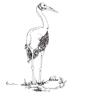 My first drawing, using the iskn, was about getting used to the pen device. I played around with pressure and such, angle of the pen, and pretty much stuck to the default pen setting this time around. There’s a ring that fits around your own pen, and a couple of magnetic rings around a stylus and pen that comes with the iskn. The drawing tablet has all these magnetic spots that line up with what you are drawing. It’s really quite smooth. Using any paper of your choice, you are freed up to draw and have the illustration appear on the screen as you draw it. It felt quite a lot more expressive than a Wacom tablet, which I already have. It also has a cord-free mode and some online storage, so you can use it on the go. Haven’t tried that yet, but will do so in short order.